YouTube turned 12 on Monday. To celebrate the milestone, the company is today launching a redesign of its desktop site, which now takes advantage of Google’s design language, Material Design, to make the site cleaner, simpler and more consistent with the YouTube app across devices. The site will also include a handful of new features, including a new dark mode, tweaks to search and channel pages, and an updated theater mode for watching videos in a larger player without going full-screen.
However, what’s under the hood is perhaps YouTube’s biggest change yet.
The site has been rebuilt on top of Polymer, the open source JavaScript library introduced at the Google I/O developer event several years ago. The benefit to using Polymer is that it allows developers to create web components that can be re-used.
The project to build YouTube on Polymer started a year ago, and is the most significant aspect to YouTube’s redesign, even though it’s less visible to end users.
“Things that get built once can then be reapplied more quickly,” explains Manuel Bronstein, VP of Product Management at YouTube, of Polymer. “It’s less about a particular feature, and it’s more about the velocity of which things can be brought to market. This then enables us to explore and then do more things,” he says.
YouTube’s new Dark Theme, for example, is something that was easier to develop thanks to Polymer.

The theming option was spotted in the wild last month, but required users to change a few settings in their Chrome browser in order to view it.
Today, Dark Theme will be a simple switch users can toggle on or off from the site itself. The idea is that by changing YouTube’s white background to black, it offers a better viewing experience when you’re watching videos at night or with the lights off. With less glare, it’s easier on your eyes and you can better see the videos’ true colors.
The company hasn’t yet confirmed if it will port Dark Theme to other devices, saying instead it will track the usage of Dark Theme first to see if the feature is widely adopted. (It seems reasonable to think that it would make its way to mobile, though – after all, if Twitter can have dark mode, surely YouTube warrants one.)

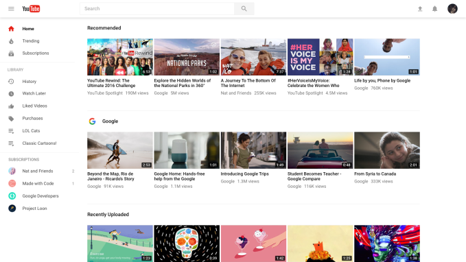
Above: Old Website

Above: New Website
The most noticeable change you’ll see when you first view the redesigned YouTube site, however, is the Material Design-infused makeover. The left-side navigational elements can now be tucked away out of view with a click on the hamburger menu at the top left of the screen and now align with what you would see on mobile.
There are three main sections at the top: Home, Trending, and Subscriptions, followed by Your Library (your saves, purchases, playlists and more), and a list of your individual subscriptions.
As you scroll down the YouTube homepage, you never reach the end. The page is now an endless list of recommendations both from channels you subscribe to as well as others YouTube thinks you’ll like.
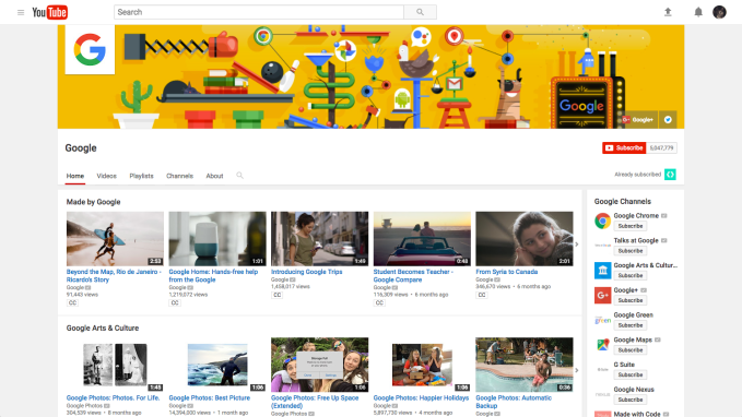
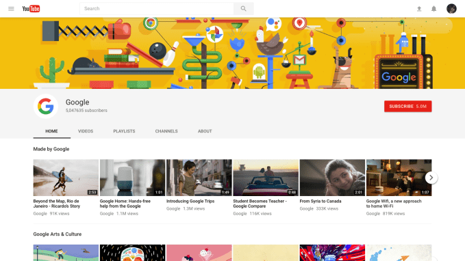
You’ll also notice that when you hop over to a channel’s page, things look a little different, too.

Above: Old Channel Page

Above: New Channel Page
The channel now features a full-width page banner at the top of the screen, and its hero media (the video that plays to introduce the channel or show off its latest content) is larger, as well.
The navigational elements with the channel (Home, Video, Playlists, Channels, Discussion, About, etc.) are larger and simpler to navigate through. Channels are tucked away under their tab, instead of the sidebar. And with the cleaner design, the redesigned red “Subscribe” button – which grew in size, too – really pops against background.
When you’re watching a video on the channel, the “Theater Mode” option has been tweaked to be slightly wider than before and now features a black background.
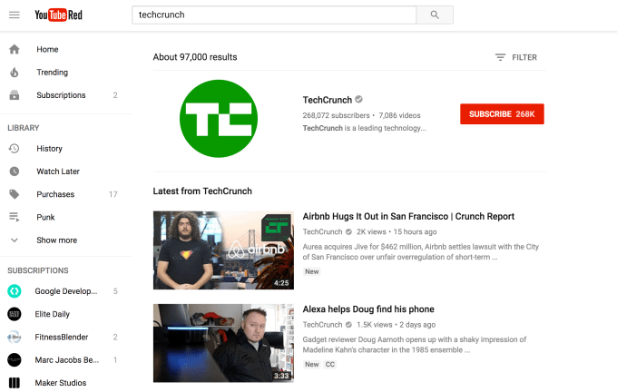
That big, red “Subscribe” button is also more prominent in Search results on the site, and shows up at the top when a channel matches your search query. It’s also now easier to see the difference between channels and content in the search results page, as a result.

What you might not immediately notice, as you poke around the site’s new features, is that the experience of using YouTube on the desktop might seem a little faster now. Of course, how much faster depends on several factors, like your internet speed and your device, for example. But if you happen to notice a speed bump, you’re likely not imagining things.
With the switch to Polymer, the YouTube team can now spend more time working to improve latency.
“Latency is the kind of thing you can always invest in making better,” says Bronstein. “We’re always thinking about how we can make the consumption of media more immediate, because the faster we get you to what you want to watch, the better,” he says.
Users today will have to opt-in to try out YouTube’s new look by visiting youtube.com/new. If you want to return to the old YouTube, you can select “Restore classic YouTube” from your Account Menu.
The company cautions the new YouTube is still a work in progress, and there will be a cap of some sort on how many people will be able to opt into the new experience.


No comments:
Post a Comment